West Law Office
Rebrand & Identity
West Law Office
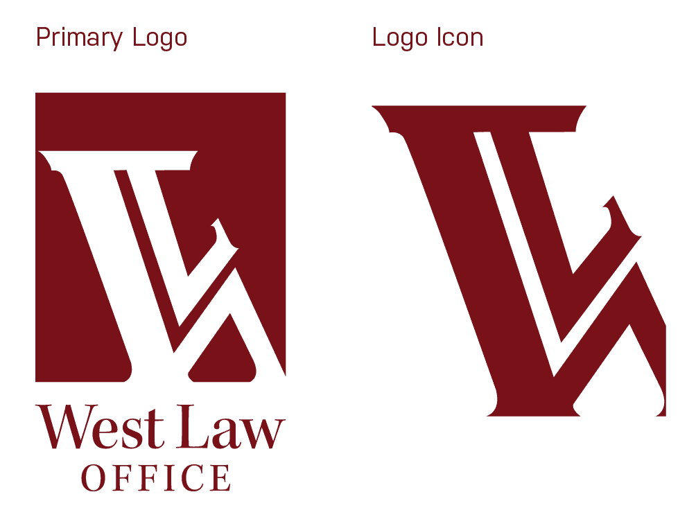
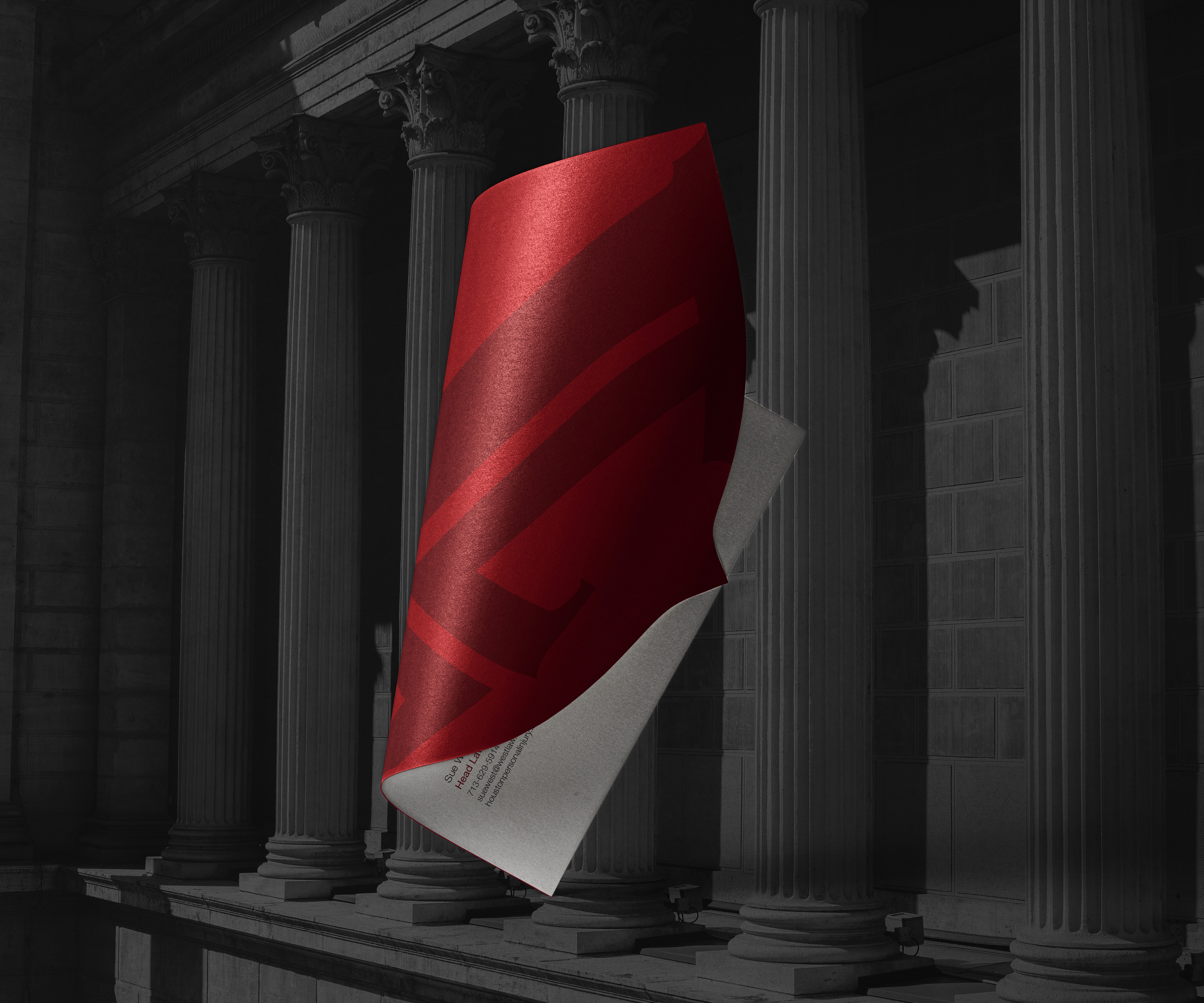
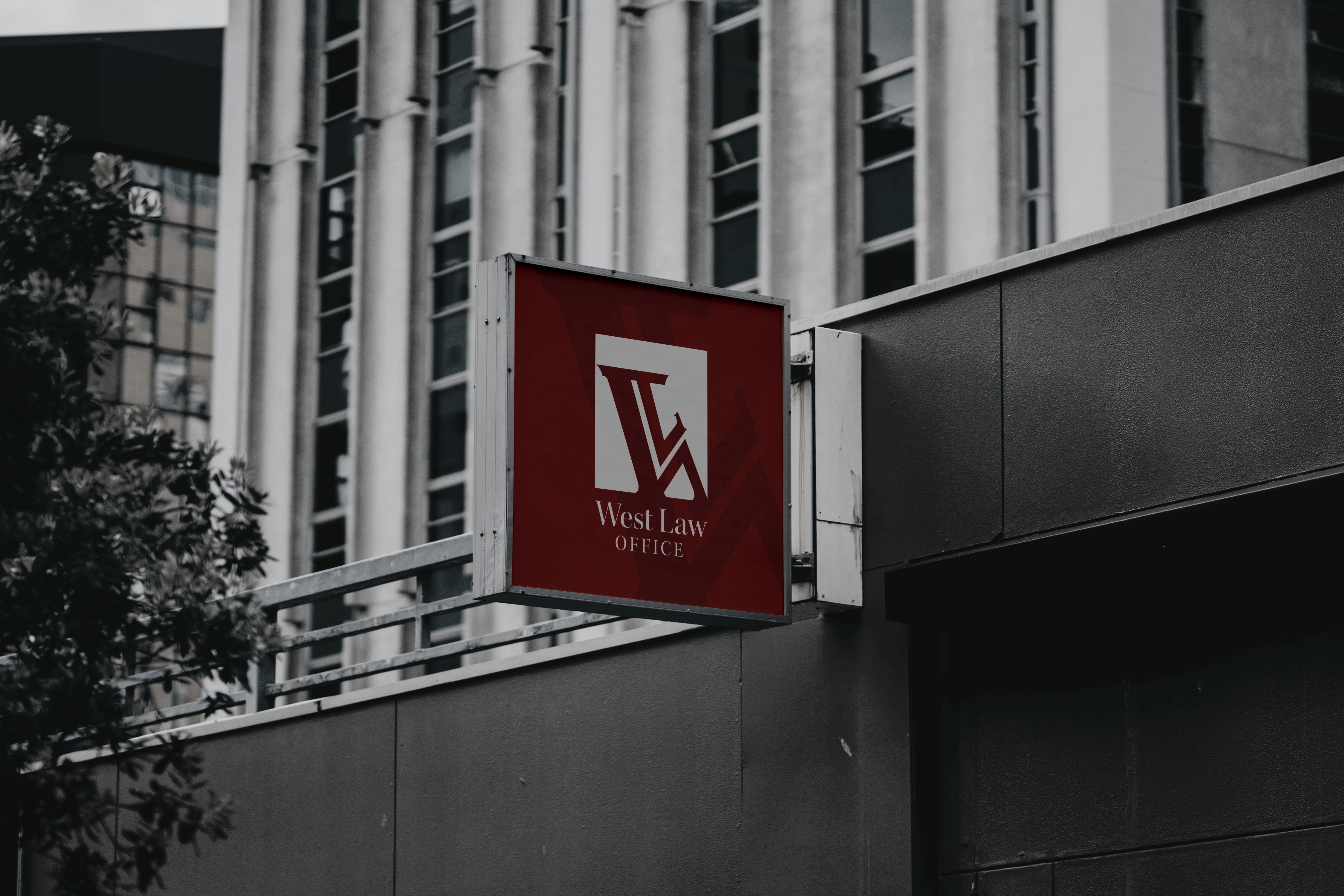
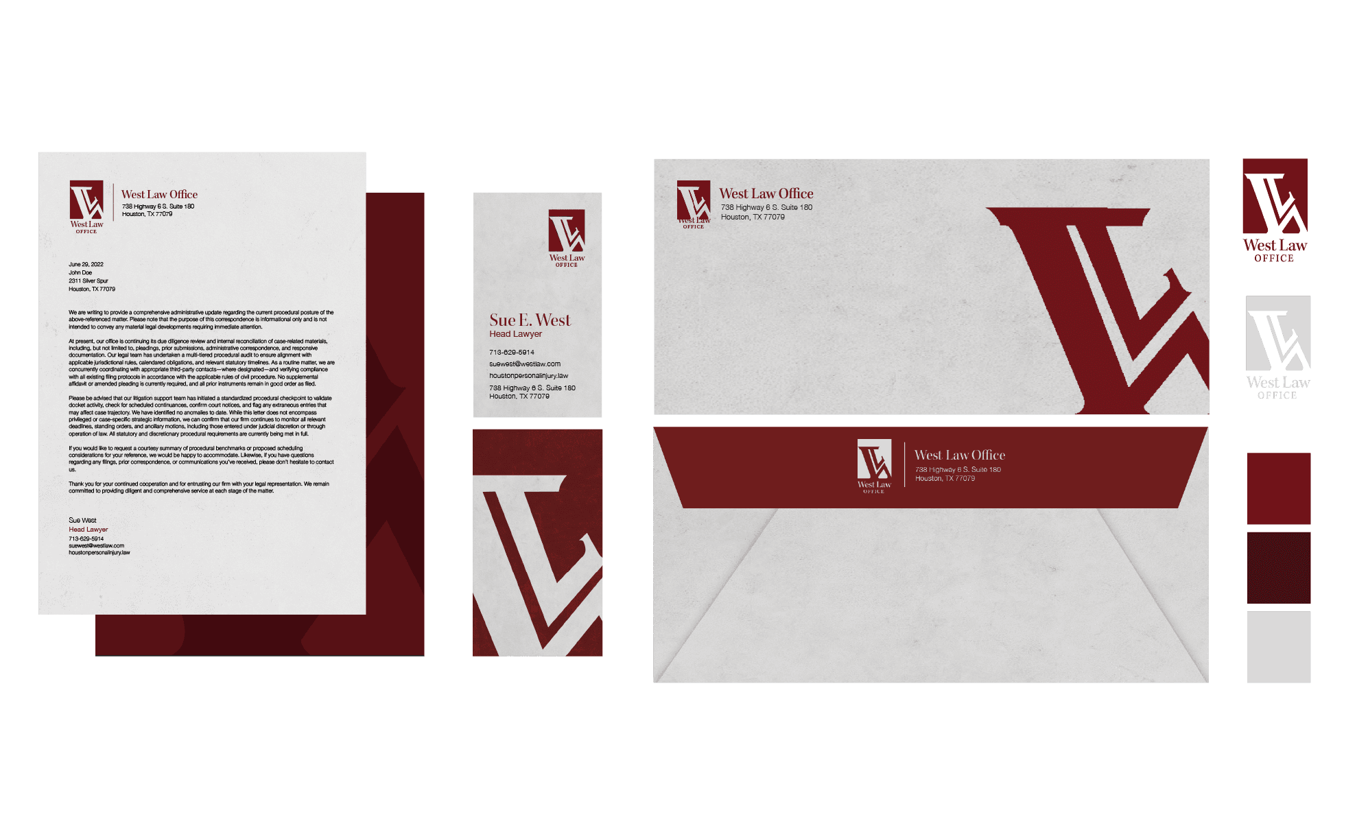
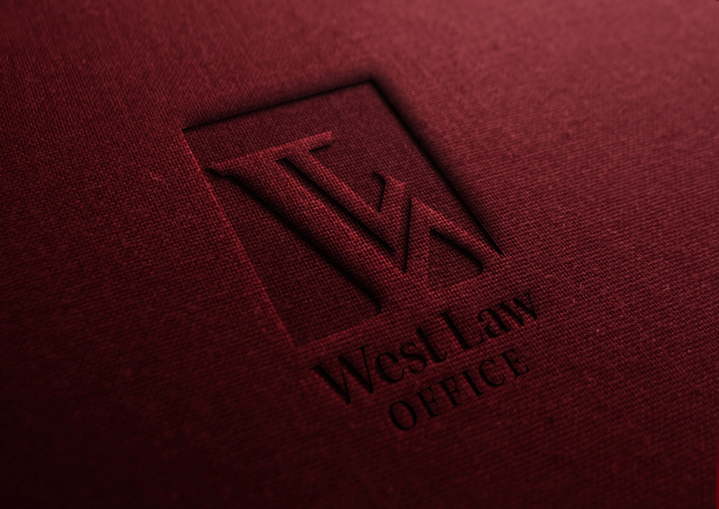
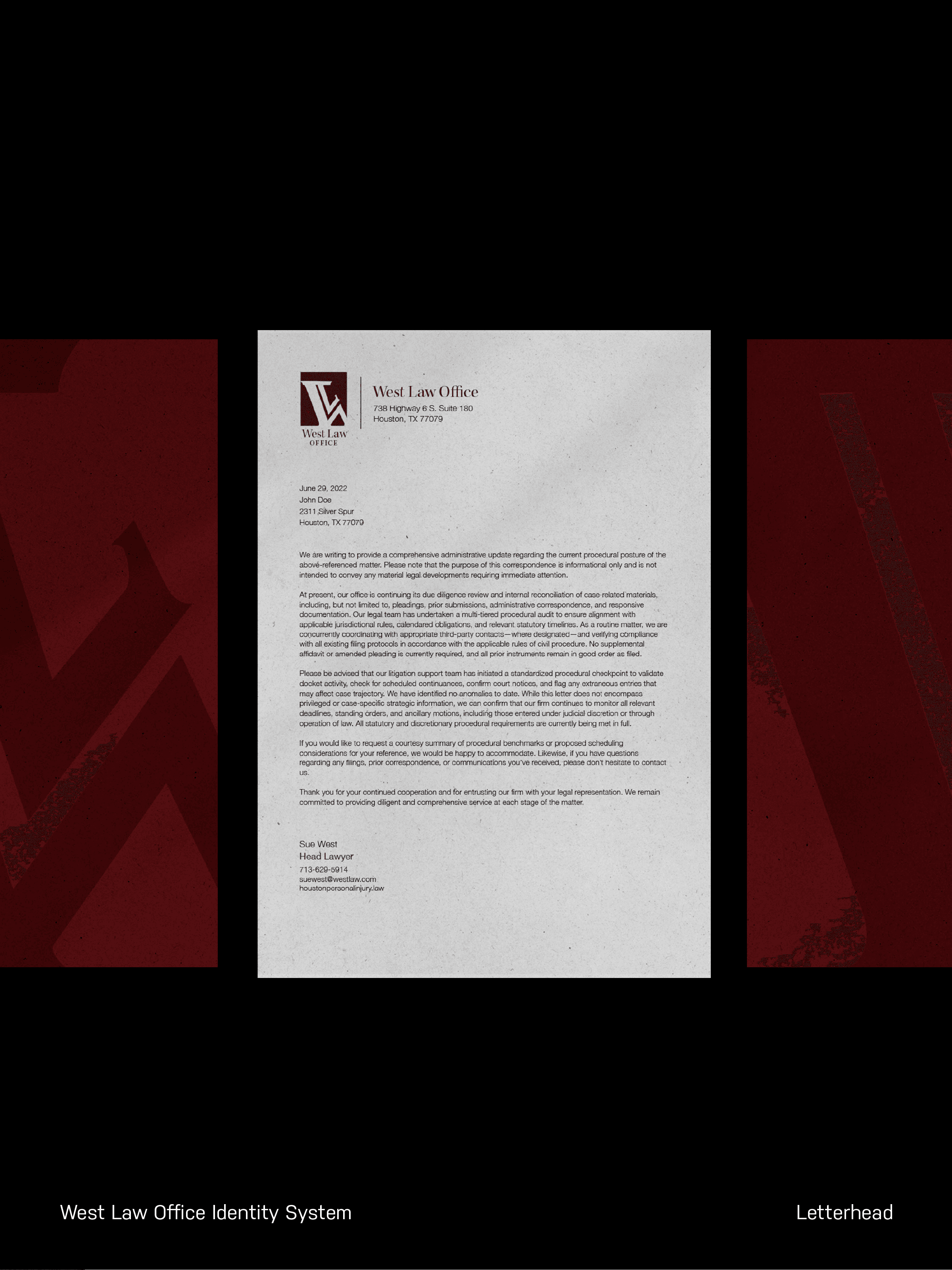
West Law Office is a rebrand focused on refreshing the firm’s visual identity. The design task was to develop a cohesive brand system that reflects professionalism, clarity, and the firm’s continued commitment to dependable legal service.

West Law Office’s rebrand seeks to reflect a more modern and cohesive identity while preserving the firm’s trusted reputation and commitment to clear, reliable legal service.
Branding
Identity
Behind the Project
Digital Publishing
2023
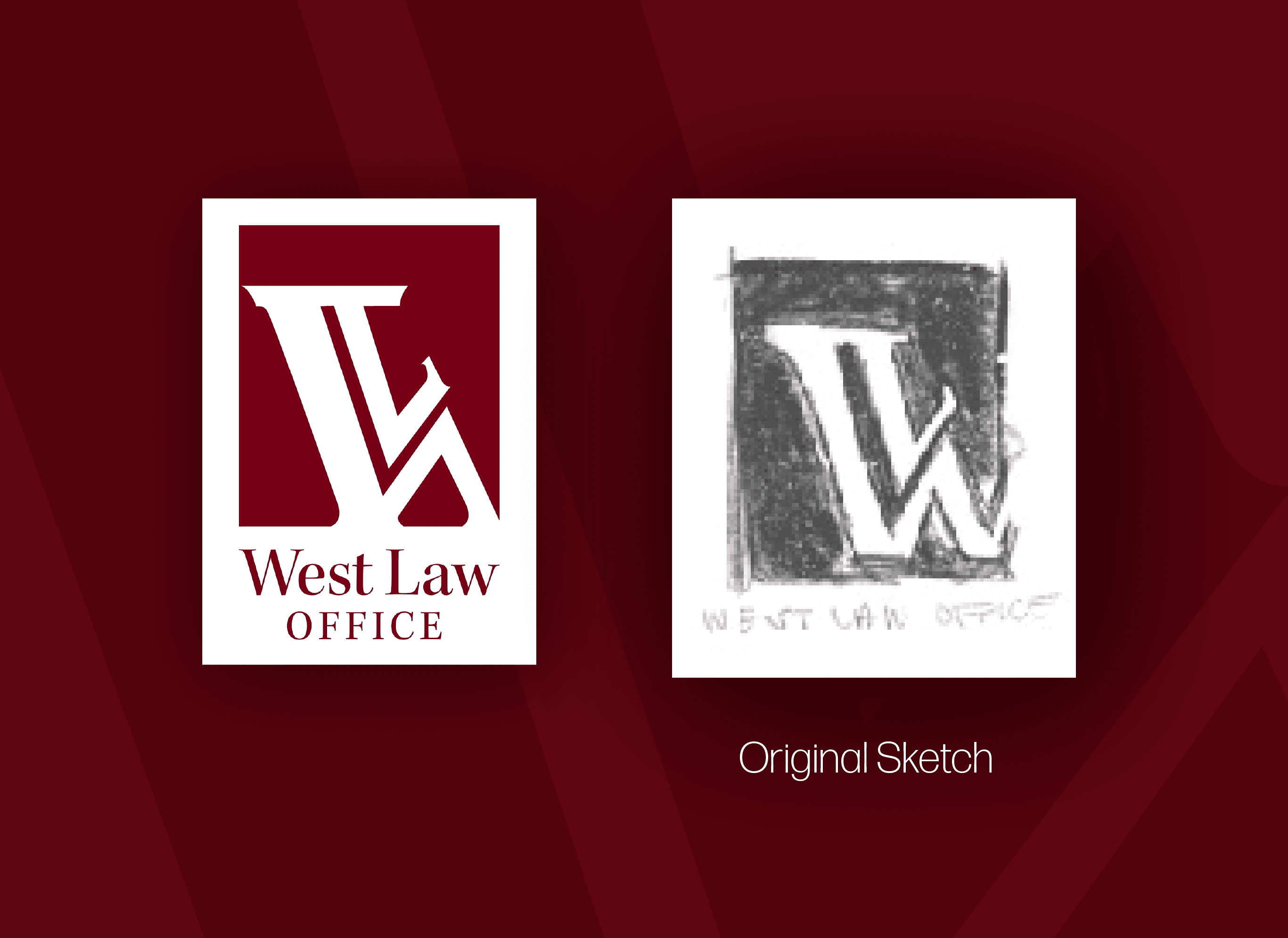
West Law Office’s rebrand was developed through an exploration of how visual identity can influence trust and perception within a professional legal setting. The goal was to move away from a dated and inconsistent look and instead create a system that felt unified, intentional, and reflective of the firm’s reliability. Throughout the process, I focused on simplifying visual elements and establishing a clear typographic hierarchy to ensure readability and consistency across applications. My design approach leaned toward a refined and minimal aesthetic, allowing the brand to communicate professionalism without feeling overly rigid, while maintaining a sense of approachability for current and prospective clients.
West Law Office
Rebrand & Identity
West Law Office
West Law Office is a rebrand focused on refreshing the firm’s visual identity. The design task was to develop a cohesive brand system that reflects professionalism, clarity, and the firm’s continued commitment to dependable legal service.
West Law Office’s rebrand seeks to reflect a more modern and cohesive identity while preserving the firm’s trusted reputation and commitment to clear, reliable legal service.
UX/UI
CSS
HTML
West Law Office’s rebrand was developed through an exploration of how visual identity can influence trust and perception within a professional legal setting. The goal was to move away from a dated and inconsistent look and instead create a system that felt unified, intentional, and reflective of the firm’s reliability. Throughout the process, I focused on simplifying visual elements and establishing a clear typographic hierarchy to ensure readability and consistency across applications. My design approach leaned toward a refined and minimal aesthetic, allowing the brand to communicate professionalism without feeling overly rigid, while maintaining a sense of approachability for current and prospective clients.
Behind the Project
Digital Publishing
2023