Love-All Tennis Summer Camp
Branding & Identity
Love-All Tennis Summer Camp
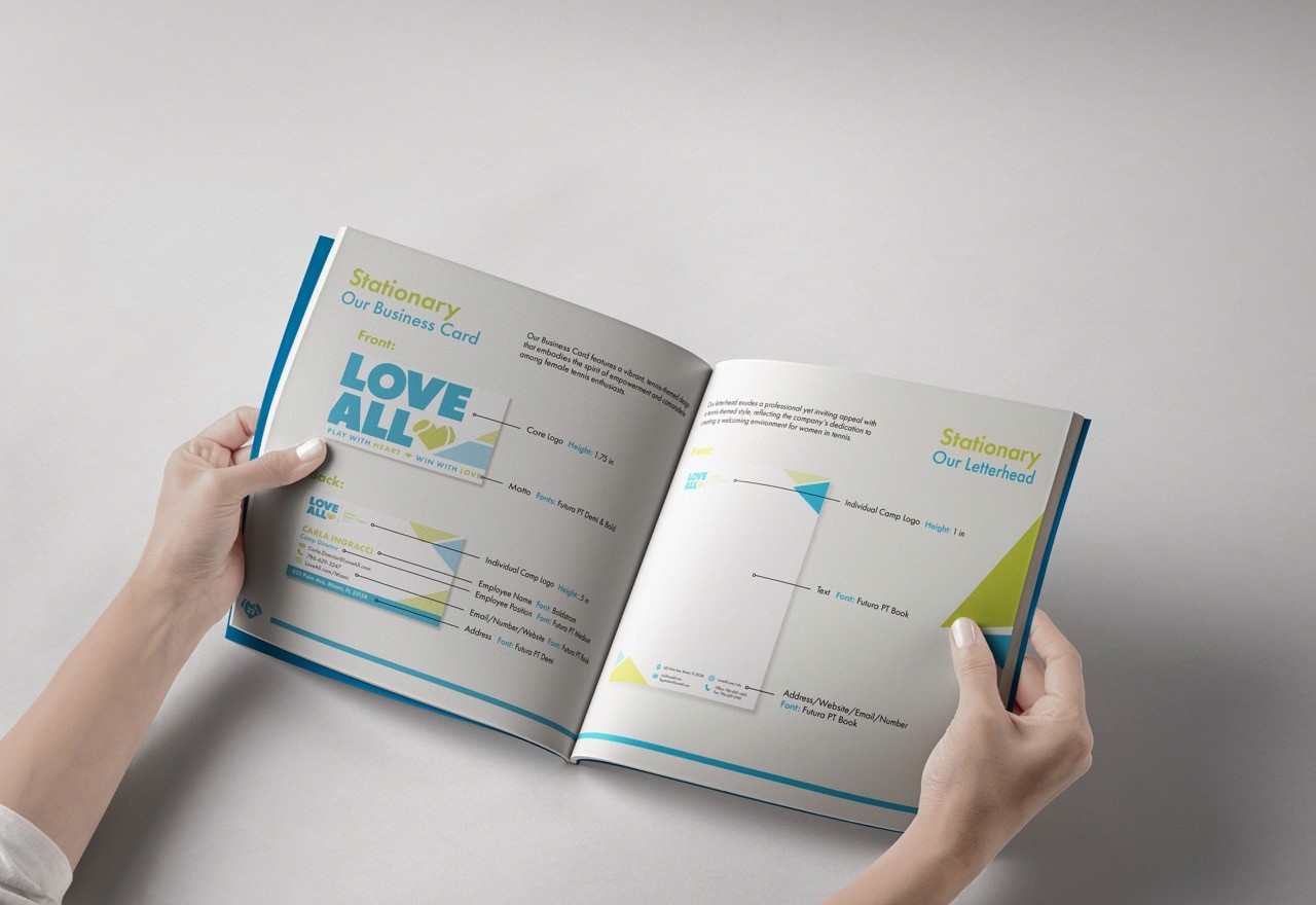
Love-All is a tennis summer camp for women invented and developed as part of a branding style guide project. The task was to create a fully realized brand identity- from the logo and company tone to stationary and social media presence expectations.

Love-All aims to establish a cohesive and energetic brand identity that reflects its mission of fostering empowerment and personal growth through tennis. The project focuses on creating a flexible yet consistent visual system that can be applied across various platforms while communicating a strong sense of community, movement, and passion for the sport.
Branding
Identity

Behind the Project
Digital Publishing
2023
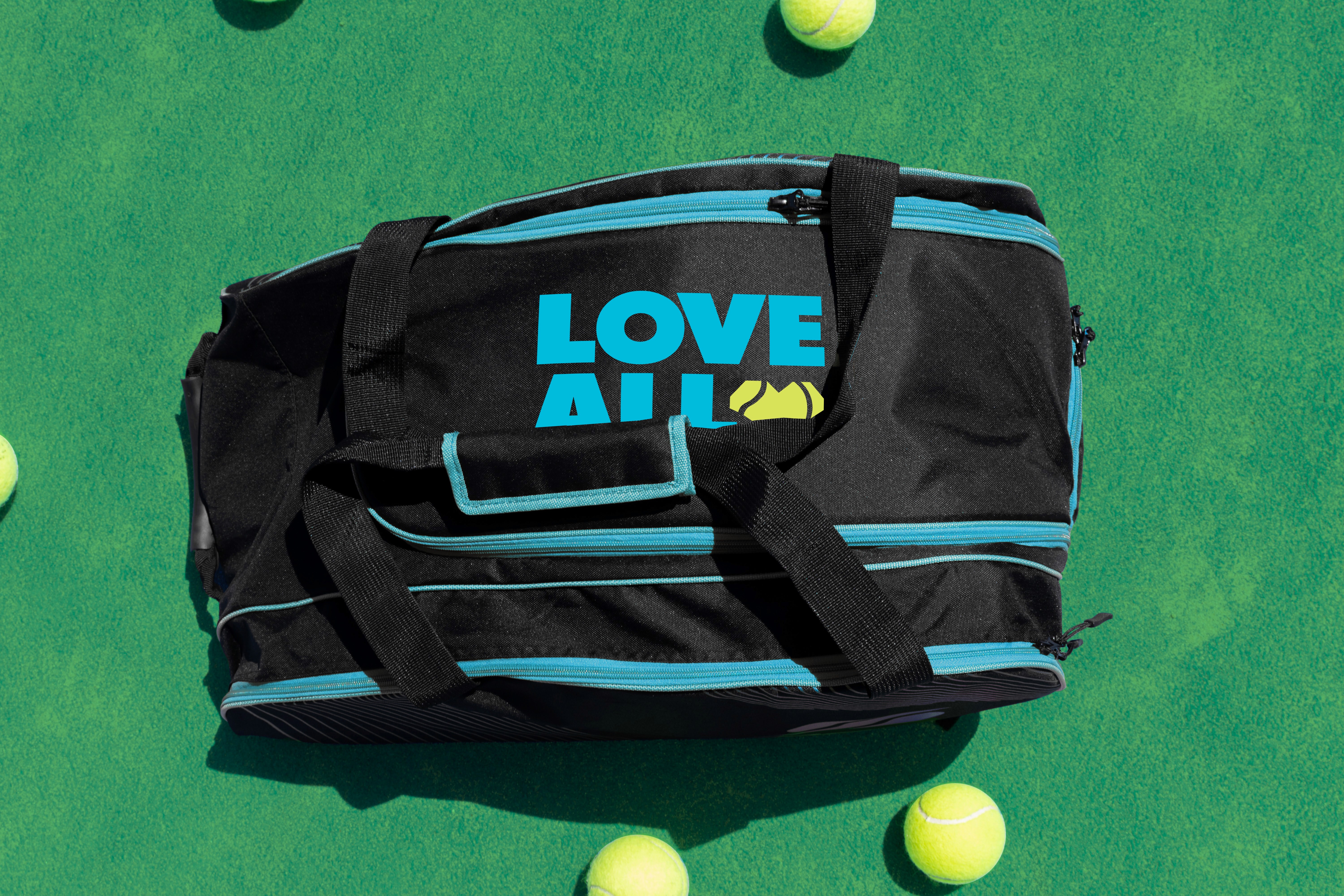
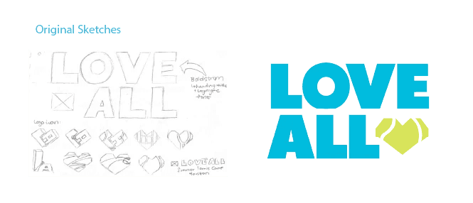
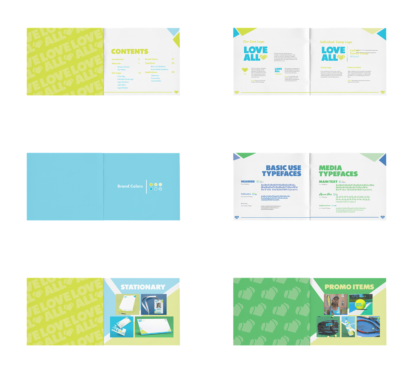
In developing Love-All, the focus extended beyond creating a logo or selecting a color palette, aiming instead to build a brand rooted in purpose. The project was approached as a fully realized summer camp experience, where each design decision aligned with its mission of empowerment and personal growth through the sport of tennis. The visual identity was crafted to reflect the energy and enthusiasm the camp seeks to foster, supported by a comprehensive style guide detailing logo usage, typography, social media strategy, and merchandise applications. Emphasis was placed on maintaining consistency across all platforms while allowing for flexibility in real-world use. This project served as an exploration of holistic brand development, considering how individual elements work together to form a cohesive and compelling narrative. Ultimately, Love-All was designed to represent more than a summer camp, embodying a mindset centered on determination, sportsmanship, and a genuine love for the game.

Love-All Tennis Summer Camp
Branding & Identity
Love-All Tennis Summer Camp
Love-All is a tennis summer camp for women invented and developed as part of a branding style guide project. The task was to create a fully realized brand identity- from the logo and company tone to stationary and social media presence expectations.
Love-All aims to establish a cohesive and energetic brand identity that reflects its mission of fostering empowerment and personal growth through tennis. The project focuses on creating a flexible yet consistent visual system that can be applied across various platforms while communicating a strong sense of community, movement, and passion for the sport.
UX/UI
CSS
HTML
In developing Love-All, the focus extended beyond creating a logo or selecting a color palette, aiming instead to build a brand rooted in purpose. The project was approached as a fully realized summer camp experience, where each design decision aligned with its mission of empowerment and personal growth through the sport of tennis. The visual identity was crafted to reflect the energy and enthusiasm the camp seeks to foster, supported by a comprehensive style guide detailing logo usage, typography, social media strategy, and merchandise applications. Emphasis was placed on maintaining consistency across all platforms while allowing for flexibility in real-world use. This project served as an exploration of holistic brand development, considering how individual elements work together to form a cohesive and compelling narrative. Ultimately, Love-All was designed to represent more than a summer camp, embodying a mindset centered on determination, sportsmanship, and a genuine love for the game.
Behind the Project
Digital Publishing
2023